Table of Contents
Introduction
Bibliometric networks are an interesting tool to study the evolution of a disciplinary field or of a topic. A bibliographic coupling network, by looking at the references shared by a corpus of documents, allows us to understand the intellectual structure of a field at a certain point of time. A bibliographic co-citation network, by looking at the number of times the references cited by a corpus are cited together, reveals the main influences of a field.1
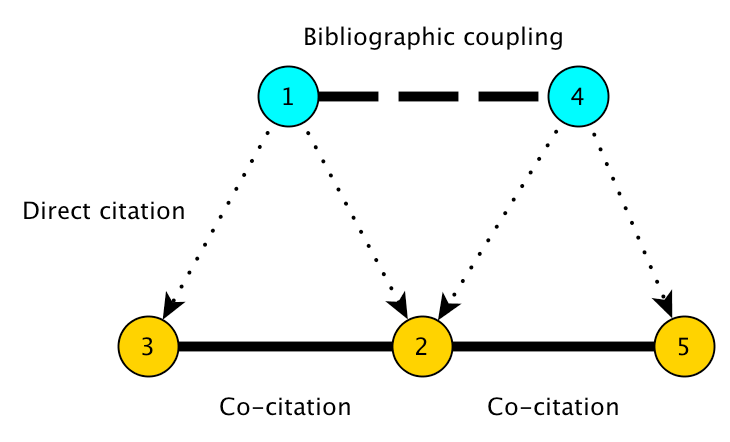
Figure 1: Bibliographic coupling and co-citation
That is the two main tools I have used in my article “From the Stagflation to the Great Inflation: explaining the US economy of the 1970s” (Goutsmedt 2021). I analysed the way economists explained the US stagflation of the 1970s (a period of high unemployment and inflation) over time. Bibliometric networks completed a qualitative reading of the relevant articles and books and helped me to underline how we went from an explanation focusing on the effects of external shocks (the end of Bretton Woods and commodity-price shocks) on growth and unemployment, in the late 1970s and early 1980s, to an explanation that focused on the Federal Reserve mistakes and the effects of monetary policy on inflation.2
However, publishing academic articles with such tools often comes with some frustration. If bibliometric networks are helpful to prove your point and to display some of your results, they are also (and I am tempted to say “above all”) an “exploratory” tool that comes upstream of a project, well before having a clear idea of what you want to demonstrate.3 You can spend some time exploring your network, studying which nodes are in which communities, studying the effects of changing some parameters (in your partitioning algorithm for instance). But at the end of the day, what you will have in your paper is this:
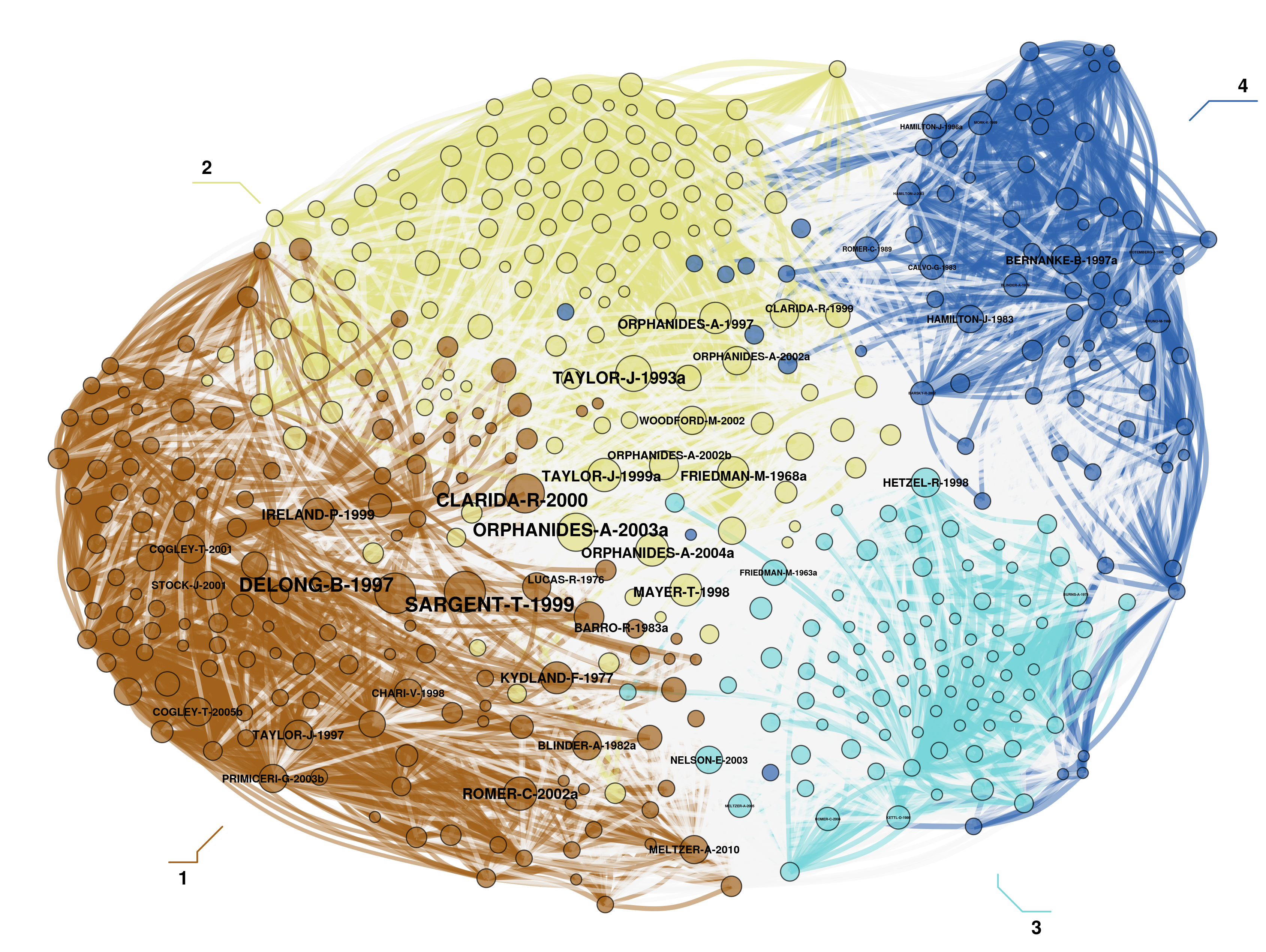
Figure 2: My co-citation network for the 1997-2013 sub-period
Even if visually informative, the picture is an attempt of summarising all the information obtained by studying the network. And of course, it heavily relies on the explanations and interpretations given by its author, as it remains very hard for an external observer to understand what it is all about. Moreover, this observer is likely to experience frustration too, as she is unable to explore the network herself and depends on the visual choices made by the author.
The rationale behind this post is to evacuate a part of this frustration. I wanted to do several things here:
- unveiling the database used for my article (and hoping that some people would like to use it in turn and complete/improve/expand it);
- exposing some useful bits of R code to produce such networks. I am notably using two R packages that I am developing with Alexandre Truc: biblionetwork and networkflow. The second one heavily relies on igraph (Csardi and Nepusz 2006), tidygraph (Pedersen 2020b) and ggraph (Pedersen 2020a) great packages.
- displaying interactive coupling and co-citation networks (the very reason for the long monologue above…).4
Before to go further, let’s charge some packages that will be useful for what follows:
cran_list <- c("data.table","magrittr","igraph","tidygraph","ggraph", "leidenAlg",
               "scico","DT","ggiraph","ggnewscale","ggrepel","htmlwidgets",
               "htmltools","widgetframe","sigmajs","dplyr","devtools")
for(p in cran_list){
  if (p %in% installed.packages()==FALSE){install.packages(p,dependencies = TRUE)}
  library(p,character.only=TRUE)
}

github_list <-  c("ParkerICI/vite","agoutsmedt/biblionetwork","agoutsmedt/networkflow")
for(p in github_list){
  if (gsub(".*/","",p) %in% installed.packages()==FALSE){devtools::install_github(p)}
  library(gsub(".*/","",p),character.only=TRUE)
}
Building a database of stagflation explanations
The first step in my article on stagflation was to decide what could be regarded as an explanation of the US stagflation and to identify the academic articles, books and book chapters responding positively to the criteria (see Goutsmedt 2021 for the whole list of criteria). I decided to focus on documents that devoted sufficient space to deal explicitly with the explanation of the phenomena.
To identify the corresponding documents, I relied on two methods:
- I took as a point of departure the 2008 NBER conference on “The Great Inflation: The Rebirth of Modern Central Banking”—published in 2013—and checked the bibliography of the conference articles dealing with the US economic situation to find new references about stagflation. I repeated the process with these new references and so on.
- I searched for all the articles with the term “Stagflation” or “Great Inflation” in their title on Web of Science (WoS) and integrated to my dataset all the articles dealing with the 1970s US stagflation. I also checked the bibliography of these documents and find new ones.
I ended up with 174 documents (articles in academic journals, working papers, books and book chapters). 104 were in the WoS database. I thus could extract the references cited by these articles (yes, that’s almost only academic articles that you find in WoS). The process for the 70 remaining documents was more time-consuming. I parsed the bibliography of these documents in anystyle and cleaned the results. Then, I had to match these new references with what I got first with WoS. I eventually ended up with 572 references cited at least twice by the 174 documents on the US stagflation. 91 stagflation documents were also part of the 572 references—meaning that 83 articles and books on stagflation were either not cited or only once by other articles or books on stagflation.
Here is all the stagflation documents and all the references cited at least twice by these documents:5
Nodes_stagflation <- as.data.table(Nodes_stagflation)
data <- datatable(Nodes_stagflation[order(Type, decreasing = TRUE),c("Author","Year","Title","Journal","Type")],
                  rownames = FALSE,
                  options =  list(scrollY = "400px",
                                  scrollCollapse = TRUE,
                                  scrollX = "400px",
                                  paging = FALSE))

frameWidget(data)
If we look at the number of documents on stagflation per year, we see that there were two waves of interest for this topic:
Nodes_stagflation %>%
          filter(Type == "Stagflation") %>%
          count(Year) %>%
        ggplot(aes(x = Year, y = n, fill = n)) +
        geom_bar(stat = "sum", show.legend = FALSE, ) +
        scale_fill_viridis(option = "A") +
        ylab("Number of Documents on Stagflation per Year") +
        xlab("Year") +
        theme_minimal() +
        scale_x_discrete(breaks = seq(1975,2013,5))
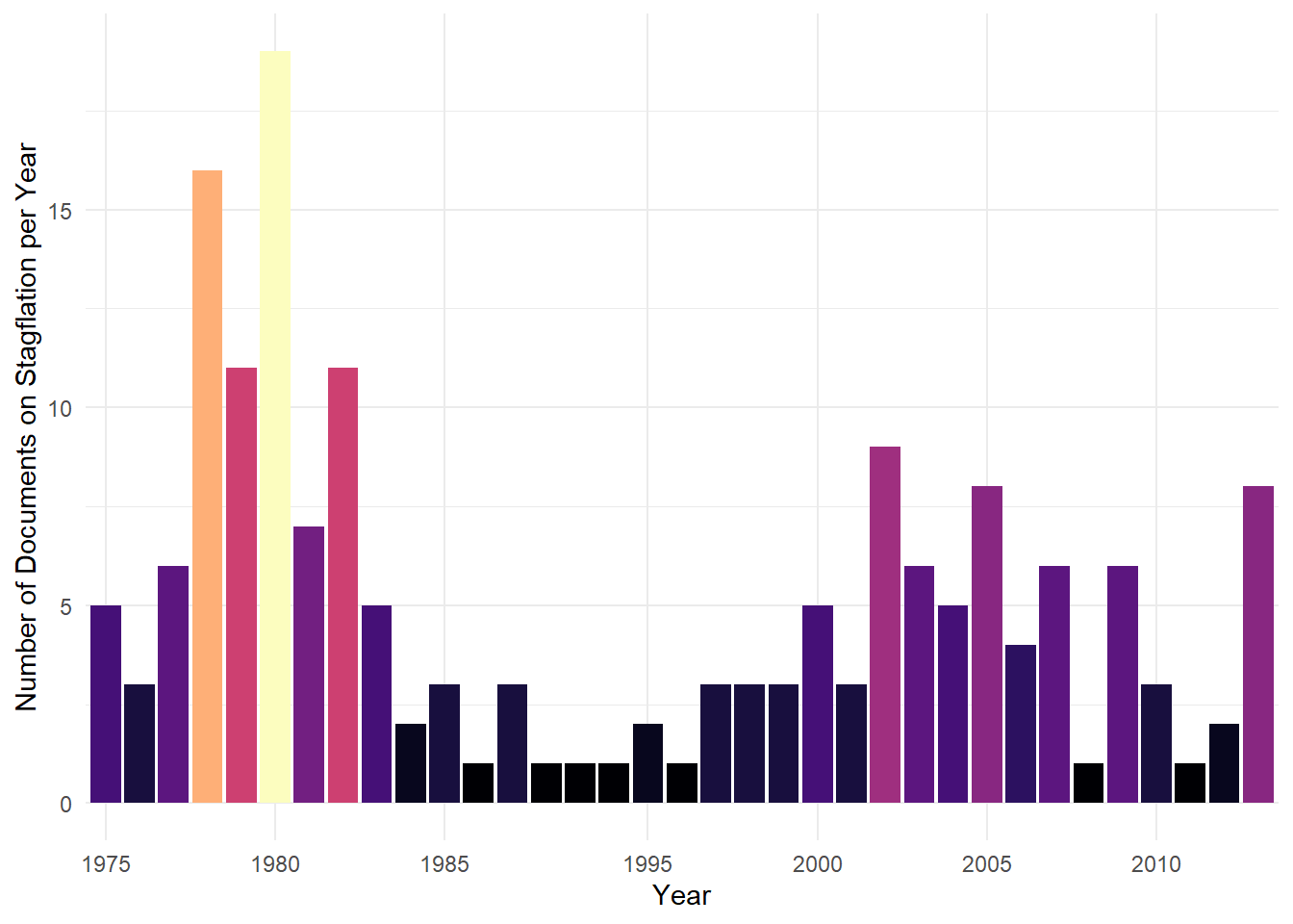
Figure 3: Number of stagflation documents per year
I have thus decided to focus on these two waves and to study two subperiods: 1975-1986; 1997-2013.
Bibliometric coupling and co-citation analyses
For each sub-period, I build a coupling and a co-citation network. The biblionetwork package, with the biblio_coupling() function, allows us to build the edges of the network, from a direct citation data frame (what each stagflation document cites), and to calculate a weight for these edges. The method for calculating the weights takes into account the size of the bibliography of each document. The biblio_cocitation() function does the same for the co-citation edges and the weights measure takes into account the total number of citations of each reference.6
The networkflow package offers functions wrapped around other packages, to simplify the analysis of networks and their projections. For creating and manipulating the network, I use the tidygraph package, which wraps the functionnalities of the classic igraph package in a tidy format. I use the Leiden algorithm (Traag, Waltman, and van Eck 2019) to find communities—groups of nodes highly connected together—in the four networks. For structuring the network in a two-dimensional space, I use the Force Atlas 2 (FA2) layout (Jacomy et al. 2014). FA2 is a force-based layout: basically, connected nodes are attracted together, and the layout minimises edges crossing. For community colors, I use the scico package (Pedersen and Crameri 2020) which brings palettes taking into account colour blindness issues.
In what follows, I use a loop with conditions, to build the four networks and prepare their projection:
graph_list <- list() # empty list to fill in the loop

# fixing some variables for the loop
start_year <- c(1975,1997)
end_year <- c(1986,2013)
network <- c("coupling","cocitation")
palette <- c("lapaz","roma")

for(i in 1:2){
  for(j in 1:length(network)){

# direct citation data, depending on the sub-period
ref <- as.data.table(Ref_stagflation) %>%
  .[Citing_ItemID_Ref %in% (as.data.table(Nodes_stagflation) %>% .[between(Year, start_year[i], end_year[i])])$ItemID_Ref]

# building the list of nodes, depending on whether we are building the coupling or co-citation network
    if(network[j] == "coupling"){
  nodes <- as.data.table(Nodes_stagflation)
    %>% .[between(Year, start_year[i], end_year[i]) & Type == "Stagflation"]
    } else {
  nodes <- as.data.table(Nodes_stagflation)
    %>% .[ItemID_Ref %in% ref$ItemID_Ref]
    }

# calculating the number of citations of each node within the period
nb_cit <- ref[, .N, ItemID_Ref]
colnames(nb_cit)[colnames(nb_cit) == "N"] <- "size"
nodes <- merge(nodes, nb_cit, by.x = "ItemID_Ref", by.y = "ItemID_Ref", all.x = TRUE)

# setting the value of article with no citation to 0,5 to display them in the visualisation,
#but at a smaller size than articles with one citation
nodes[is.na(size), size:= 0.5]

# finding the edges and calculating their weight using the `biblionetwork` package
 if(network[j] == "coupling"){
  edges <- biblio_coupling(ref, "Citing_ItemID_Ref", "ItemID_Ref")
    } else {
  ref <- ref[ItemID_Ref %in% nodes$ItemID_Ref]
  edges <- biblio_cocitation(ref, "Citing_ItemID_Ref", "ItemID_Ref")
    }

# creating the graph with `networkflow` package
graph <- tbl_main_component(edges = edges,
                            nodes = nodes,
                            directed = FALSE,
                            node_key = "ItemID_Ref")

# finding communities
graph <- leiden_workflow(graph, niter = 1000)

# giving colors

graph <- community_colors(graph,
                          palette = c(scico(6, begin = 0.2, end = 0.9, palette = palette[j])))

# calculating coordinates using the package `vite` and its Force Atlas 2 implementation
graph <- vite::complete_forceatlas2(graph,
                                    first.iter = 5000,
                                    overlap.method = "repel",
                                    overlap.iter = 1000)

graph_list[[paste(as.character(i),"-",as.character(network[j]))]] <- graph
}
}
In my article, I use the ggraph package to project the networks. Here, I resort to the sigmajs package (Coene 2020) for building interactive graphs. It relies on the Sigma javascript library, which is also used for the software GEPHI.
The 1975-1986 period
# Isolating the nodes and giving the proper names to the columns,
# to project with sigmajs
nodes <- graph_list[[1]] %>%
  activate(nodes) %>%
  as_tibble() %>%
  rename(id = Id) %>%
  mutate(label = paste0(Author_date,", ",Title,", ",Journal)) %>%
  select(id,Year,Author,label,Title,Journal,size,color,x,y)

edges <- graph_list[[1]] %>%
  activate(edges) %>%
  as_tibble() %>%
  rename(source = Source, target = Target, size = weight, color = color_edges) %>%
  mutate(id = 1:n()) %>%
  select(id,source,target,color,size) %>%
  as.data.table()

# every identifier in character format for projection
nodes$id <- as.character(nodes$id)
edges$source <- as.character(edges$source)
edges$target <- as.character(edges$target)
edges$id <- as.character(edges$id)

# projecting the interactive graph
x <- sigmajs() %>% # initialise
      sg_nodes(nodes, id, label, size, color, x, y) %>% # add nodes
      sg_edges(edges, id, source, target, size, color) %>% # add edges
      sg_settings(drawLabels = FALSE, drawEdgeLabels = FALSE,
                 defaultEdgeType = "curve", minNodeSize = 3, maxNodeSize = 20,
                minEdgeSize = 0.5, maxEdgeSize = 3,
                 borderSize = 0.5, labelHoverBGColor = "node", singleHover = TRUE,
                 hideEdgesOnMove = TRUE, zoomMin = 0.4, zoomMax = 1.2) %>%
      sg_neighbors()

frameWidget(x)
A more detailed analysis could be find in my article, but the major results to highlight are:
- The centre of the graph is occupied by Robert Gordon’s papers (Gordon 1975a, 1975b, 1977), as well as Phelps (1978), which are highly cited (the size of a node corresponds to its number of citation within the sub-period). Sachs (1979) and Perry (1978) are also highly cited nodes, in communities close to the central dense part of the graph. Several of these articles have been published in the Brookings Papers on Economic Activity and gave an important role to supply-shocks (notably commodity price shocks) and inflation inertia.
- The community North-East—the one with Milton Friedman’s Nobel Prize article (Friedman 1977)—echoes the “schools of thought” debates of the 1970s, with the opposition between Keynesians and Monetarists. That is clearly a peripheral community.
# Isolating the nodes and giving the proper names to the columns,
# to project with sigmajs
nodes <- graph_list[[2]] %>%
  activate(nodes) %>%
  as_tibble() %>%
  rename(id = Id) %>%
  mutate(label = paste0(Author_date,", ",Title,", ",Journal)) %>%
  select(id,Year,Author,label,Title,Journal,size,color,x,y)

edges <- graph_list[[2]] %>%
  activate(edges) %>%
  as_tibble() %>%
  rename(source = Source, target = Target, size = weight, color = color_edges) %>%
  mutate(id = 1:n()) %>%
  select(id,source,target,color,size) %>%
  as.data.table()

nodes$id <- as.character(nodes$id)
edges$source <- as.character(edges$source)
edges$target <- as.character(edges$target)
edges$id <- as.character(edges$id)


x <- sigmajs() %>% # initialise
      sg_nodes(nodes, id, label, size, color, x, y) %>% # add nodes
      sg_settings(drawLabels = FALSE, drawEdgeLabels = FALSE,
                 defaultEdgeType = "curve", minNodeSize = 2, maxNodeSize = 18,
                 minEdgeSize = 0.5, maxEdgeSize = 2,
                 borderSize = 2, labelHoverBGColor = "node", singleHover = TRUE,
                 hideEdgesOnMove = TRUE, zoomMin = 0.4, zoomMax = 1.2) %>%
      sg_edges(edges, id, source, target, size, color) %>% # add edges
      sg_neighbors()

frameWidget(x)
For the co-citation network, we can observe that:
- The most central (and highly cited nodes) are the same than in the coupling network. Major references for the stagflation documents are stagflation documents themselves, and we can see that the articles valuing supply-shocks and inflation inertia explanations are central.
- Friedman’s work, notably its famous 1967 AEA presidential lecture (Friedman 1968), and rational expectations contributions (Lucas 1973; Barro 1976) are South-East of the graph, in a relatively marginal communities. In other words, many articles that are currently considered as central in the history of macroeconomics, were not important for explaining stagflation in the late 1970s and early 1980s.
The 1997-2013 period
# Isolating the nodes and giving the proper names to the columns,
# to project with sigmajs
nodes <- graph_list[[3]] %>%
  activate(nodes) %>%
  as_tibble() %>%
  rename(id = Id) %>%
  mutate(label = paste0(Author_date,", ",Title,", ",Journal)) %>%
  select(id,Year,Author,label,Title,Journal,size,color,x,y)

edges <- graph_list[[3]] %>%
  activate(edges) %>%
  as_tibble() %>%
  rename(source = Source, target = Target, size = weight, color = color_edges) %>%
  mutate(id = 1:n()) %>%
  select(id,source,target,color,size) %>%
  as.data.table()
nodes$id <- as.character(nodes$id)
edges$source <- as.character(edges$source)
edges$target <- as.character(edges$target)
edges$id <- as.character(edges$id)


x <- sigmajs() %>% # initialise
      sg_nodes(nodes, id, label, size, color, x, y) %>% # add nodes
      sg_settings(drawLabels = FALSE, drawEdgeLabels = FALSE,
                 defaultEdgeType = "curve", minNodeSize = 3, maxNodeSize = 20,
                 minEdgeSize = 0.5, maxEdgeSize = 1.8,
                 borderSize = 2, labelHoverBGColor = "node", singleHover = TRUE,
                 hideEdgesOnMove = TRUE, zoomMin = 0.4, zoomMax = 1.2) %>%
      sg_edges(edges, id, source, target, size, color) %>% # add edges
      sg_neighbors()

frameWidget(x)
In the second sub-period, we can see that:
- there is a marginal group North of the graph. That is the documents dealing with the oil shocks of the 1970s. The most cited reference of the group, Clarida, Galí, and Gertler (2000), but also, for instance, Barsky and Kilian (2002), rejected the supply-shock explanation of the 1970s.
- The documents in the two other communities did not really address supply-shocks and focused on monetary policy and debated what are the main reasons for explaning the FED’s inability to stop inflation.
# Isolating the nodes and giving the proper names to the columns,
# to project with sigmajs
nodes <- graph_list[[3]] %>%
  activate(nodes) %>%
  as_tibble() %>%
  rename(id = Id) %>%
  mutate(label = paste0(Author_date,", ",Title,", ",Journal)) %>%
  select(id,Year,Author,label,Title,Journal,size,color,x,y)

edges <- graph_list[[3]] %>%
  activate(edges) %>%
  as_tibble() %>%
  rename(source = Source, target = Target, size = weight, color = color_edges) %>%
  mutate(id = 1:n()) %>%
  select(id,source,target,color,size) %>%
  as.data.table()

nodes$id <- as.character(nodes$id)
edges$source <- as.character(edges$source)
edges$target <- as.character(edges$target)
edges$id <- as.character(edges$id)


x <- sigmajs() %>% # initialise
      sg_nodes(nodes, id, label, size, color, x, y) %>% # add nodes
      sg_settings(drawLabels = FALSE, drawEdgeLabels = FALSE,
                 defaultEdgeType = "curve", minNodeSize = 3, maxNodeSize = 18,
                 minEdgeSize = 0.5, maxEdgeSize = 2,
                 borderSize = 2, labelHoverBGColor = "node", singleHover = TRUE,
                 hideEdgesOnMove = TRUE, zoomMin = 0.4, zoomMax = 1.2) %>%
      sg_edges(edges, id, source, target, size, color) %>% # add edges
      sg_neighbors()

frameWidget(x)
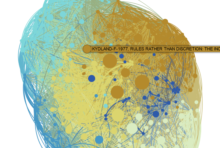
When we look at co-citation, we see that:
- Clarida, Galí, and Gertler (2000), DeLong (1997), Orphanides (2003) and Sargent (1999) are the most cited references and are central in the graph, meaning that they are cited by many articles in each community.
- References on oil-shocks, like Hamilton (1983) empirical study about the effects of oil shocks on output and inflation, are situated North of the graph and relatively peripheral.
- Friedman (1968), Lucas (1976), Kydland and Prescott (1977) and Barro and Gordon (1983), which were not influential in the 1970s-1980s for explaining stagflation—whereas they are considered as path-breaking articles in the history of macroeconomics—became highly cited references by different communities.
These four graphs reveal a similar story: the methodological battles of the 1970s made marginal apparitions in the contributions explaining the US stagflation in the 1970s and early 1980s. Supply-shocks and inflation inertia were seen as the major mechanisms underlying the stagflation and the minority which proposed alternative explanations was forced to deal also with the supply-shocks explanation. After 1997, stagflation explanations largely differed from the 1970s and 1980s, and focused on the role played by the monetary policy of the Fed, questioning the role of distorting political pressure, bad economic ideas, bad policies and inappropriate institutional settings. The path-breaking contributions that stimulated methodological debates in macroeconomics in the 1970s, and which were mostly ignored in the stagflation literature at the time, were now central references.7
Another package for building interactive networks
By way of conclusion, I would like to write some words on the building of interactive networks. The sigmajs package is great as it allows R users to resort to Sigma Javascript library, which is a really great tool for network visualisations. With very few manipulations, you can build an interactive graph with interesting features (displaying labels and seeing connected nodes when clicking on one node). However, it offers only limited possibilities, in comparisons to ggraph for instance, to change the visual features of your graph (for instance, putting a border line around each node, having a long label on several lines or changing edges and nodes opacity).
Consequently, I have also tried the ggiraph package (Gohel and Skintzos 2020), which relies on ggplot2. It allows me to do something similar to the ggraph visualisations of my article. It is more flexible, notably for the label. But the zoom function appears less fluid, and above all I was unable to reproduce sigmajs feature when clicking on the nodes.8
# Extracting the labl of most cited nodes (networkflow function)
top_nodes  <- top_nodes(graph_list[[1]], top_n = 5, top_n_per_com = 0, ordering_column = "size")

# building the graph like in ggraph, but using geom_point_interactive()
graph <- ggraph(graph_list[[1]], "manual", x = x, y = y) +
  geom_edge_arc(aes(color = color_edges, width = weight), alpha = 0.4, strength = 0.2, show.legend = FALSE) +
  scale_edge_width_continuous(range = c(0.1,2)) +
  scale_edge_colour_identity() +
  geom_point_interactive(aes(x = x, y = y, tooltip = paste0(Author_date,"\nTitle: ",Title,"\nJournal: ",Journal), data_id = Com_ID, size = size, fill = color), pch = 21, alpha = 0.9, show.legend = FALSE) +
  scale_size_continuous(range = c(0.2,13)) +
  scale_fill_identity() +
  new_scale("size") +
  geom_text(data=top_nodes, aes(x=x, y=y, label = Author_date), size = 3, fontface="bold", alpha = 1, show.legend = FALSE) +
  scale_size_continuous(range = c(0.5,5)) +
  theme_void()

# transforming the graph in an interactive graph with ggiraph
x <- girafe(ggobj = graph)

x <- girafe_options(x = x,
                    opts_tooltip(opacity = .8, use_fill = TRUE),
                    opts_zoom(min = 0.8, max = 4),
                    sizingPolicy(defaultWidth = "100%", defaultHeight = "250px"),
                    opts_hover_inv(css = "opacity:0.1;"),
                    opts_hover(css = "opacity:1;r:5pt;"))

frameWidget(x)
References
Barro, Robert J. 1976. “Rational Expectations and the Role of Monetary Policy.” Journal of Monetary Economics 2 (1): 1–32.
Barro, Robert J., and David B. Gordon. 1983. “A Positive Theory of Monetary Policy in a Natural Rate Model.” Journal of Political Economy 91 (4): 589–610.
Barsky, Robert B., and Lutz Kilian. 2002. “Do We Really Know That Oil Caused the Great Stagflation? A Monetary Alternative.” In NBER Macroeconomics Annual 2001, Volume 16, 137–98. MIT Press.
Boullier, Dominique, Maxime Crépel, and Mathieu Jacomy. 2016. “Zoomer n’est pas explorer.” Reseaux n° 195 (1): 131–61. https://www.cairn.info/revue-reseaux-2016-1-page-131.htm.
Clarida, Richard, Jordi Galí, and Mark Gertler. 2000. “Monetary Policy Rules and Macroeconomic Stability: Evidence and Some Theory.” The Quarterly Journal of Economics 115 (1): 147–80.
Claveau, François, and Yves Gingras. 2016. “Macrodynamics of Economics: A Bibliometric History.” History of Political Economy 48 (4): 551–92. https://read.dukeupress.edu/hope/article-abstract/48/4/551/12684/Macrodynamics-of-Economics-A-Bibliometric-History.
Coene, John. 2020. Sigmajs: Interface to ’Sigma.js’ Graph Visualization Library. https://CRAN.R-project.org/package=sigmajs.
Csardi, Gabor, and Tamas Nepusz. 2006. “The Igraph Software Package for Complex Network Research.” InterJournal Complex Systems: 1695. https://igraph.org.
DeLong, J Bradford. 1997. “America’s Peacetime Inflation: The 1970s.” In Reducing Inflation. Motivation and Strategy, 247–80. Chicago: University of Chicago Press.
Friedman, Milton. 1968. “The Role of Monetary Policy.” American Economic Review 58 (1): 1–17.
———. 1977. “Nobel Lecture: Inflation and Unemployment.” Journal of Political Economy 85 (3): 451–72.
Gingras, Yves. 2016. Bibliometrics and Research Evaluation: Uses and Abuses. The MIT Press. https://direct.mit.edu/books/book/4081/bibliometrics-and-research-evaluationuses-and.
Gohel, David, and Panagiotis Skintzos. 2020. Ggiraph: Make ’Ggplot2’ Graphics Interactive. https://CRAN.R-project.org/package=ggiraph.
Gordon, Robert J. 1975a. “Alternative Responses of Policy to External Supply Shocks.” Brookings Papers on Economic Activity 1975 (1): 183–206.
———. 1975b. “The Impact of Aggregate Demand on Prices.” Brookings Papers on Economic Activity 1975 (3): 613–70.
———. 1977. “Can the Inflation of the 1970s Be Explained?” Brookings Papers on Economic Activity 1977 (1): 253–79.
Goutsmedt, Aurélien. 2021. “From the Stagflation to the Great Inflation: Explaining the US Economy of the 1970s.” Revue d’Economie Politique Forthcoming. https://aurelien-goutsmedt.com/media/pdf/stagflation-great-inflation.pdf.
Hamilton, James D. 1983. “Oil and the Macroeconomy Since World War II.” Journal of Political Economy 91 (2): 228–48.
Jacomy, Mathieu, Tommaso Venturini, Sebastien Heymann, and Mathieu Bastian. 2014. “ForceAtlas2, a Continuous Graph Layout Algorithm for Handy Network Visualization Designed for the Gephi Software.” PloS One 9 (6): e98679.
Kydland, Finn E., and Edward C. Prescott. 1977. “Rules Rather Than Discretion: The Inconsistency of Optimal Plans.” Journal of Political Economy 85 (3): 473–92.
Lucas, Robert E. 1973. “Some International Evidence on Output-Inflation Tradeoffs.” American Economic Review 63 (3): 326–34.
———. 1976. “Econometric Policy Evaluation: A Critique.” Carnegie-Rochester Conference Series on Public Policy 1: 19–46.
Orphanides, Athanasios. 2003. “The Quest for Prosperity Without Inflation.” Journal of Monetary Economics 50 (3): 633–63.
Pedersen, Thomas Lin. 2020a. Ggraph: An Implementation of Grammar of Graphics for Graphs and Networks. https://CRAN.R-project.org/package=ggraph.
———. 2020b. Tidygraph: A Tidy API for Graph Manipulation. https://CRAN.R-project.org/package=tidygraph.
Pedersen, Thomas Lin, and Fabio Crameri. 2020. Scico: Colour Palettes Based on the Scientific Colour-Maps. https://CRAN.R-project.org/package=scico.
Perry, George L. 1978. “Slowing the Wage-Price Spiral: The Macroeconomic View.” Brookings Papers on Economic Activity 1978 (2): 259–99.
Phelps, Edmund S. 1978. “Commodity-Supply Shock and Full-Employment Monetary Policy.” Journal of Money, Credit and Banking 10 (2): 206–21.
Sachs, Jeffrey D. 1979. “Wages, Profits, and Macroeconomic Adjustment: A Comparative Study.” Brookings Papers on Economic Activity 1979 (2): 269–332.
Sargent, Thomas J. 1999. The Conquest of American Inflation. Princeton: Princeton University Press.
Traag, Vincent A, Ludo Waltman, and Nees Jan van Eck. 2019. “From Louvain to Leiden: Guaranteeing Well-Connected Communities.” Scientific Reports 9 (1): 1–12.
Weingart, Scott B. 2015. “Finding the History and Philosophy of Science.” Erkenntnis 80 (1): 201–13. https://doi.org/10.1007/s10670-014-9621-1.
For introduction and application of bibliographic coupling and co-citation methods, see Gingras (2016), Claveau and Gingras (2016), and Weingart (2015). ↩︎
The issue of how we explain the US stagflation regularly reappears. See for instance Paul Krugman’s blog post. ↩︎
It should be clear however that bibliometric networks are never a proof in themselves. They are always subject to a lot of interpretations and what we see has always to be taken with great care (for an nice illustration, in French, see Boullier, Crépel, and Jacomy 2016). ↩︎
What follows it not an attempt to reproduce exactly the results of my paper. With developing the networkflow package, part of my script have changed, as well as the algorithm implementation I use for Force Atlas 2 and Leiden. Besides, I could not keep the same seed, and thus the partition and spacialisation results could be slightly different. However, I am confident that it is not going against the interpretation of my results I had in the article. ↩︎
As it involved a lot of hand cleaning, it is likely that some mistakes remain. It does not impact the analysis, but the metadata are not perfectly clean. ↩︎
The basic idea is that if two highly cited documents are cited once together, their link has to be weaker than if these two document were rarely cited. ↩︎
In my article, I supported the analyses above by studying further the networks—for instance, by studying the share of links between communities—and by quantitative textual analysis. ↩︎
I did not find any way to highlight the nodes connected to a certain node. For those who have some inspiration, the question is here. ↩︎
Aurélien Goutsmedt
Post-Doctoral Researcher
My research interests include history of economics, economic expertise and bibliometrics.